Designing Your Brand Identity
If your firm is already operating, you likely have a brand identity. Regardless, consider this an opportunity to refine it further.
One of my goals with Marketing for Architects is to keep the tips and tools straightforward. As an architect myself, I know how tempting it is to fixate on details, especially related to naming and visual branding. Let’s strive for progress over perfection.
Your Branding is More than Your Logo
Most people starting a business think they “just need a logo.” As an architect, this is akin to a potential client telling you they “just need a floor plan.”
Your brand is about much more than your logo. You also communicate your brand through your values, the language you use, and even the buildings you design.
Key Elements of Your Brand Identity
Your brand is how the world perceives your company. Intentional or not, your business has a brand.
Designing your brand identity gives you more control over how your brand is perceived. Shaping your brand is similar to how you may think about your personal reputation. What you wear, how you speak to others, and how you make people feel reflects who you are and what you value.
The basic elements of your brand identity include visuals, such as your logo, color palette, and typography, and other elements, such as your name, voice, and messaging.
Name
The name of your design firm is an essential tool to communicate with potential clients. This will be a stand-alone topic in a future issue, but a couple of rules of thumb include avoiding names that are difficult to say or spell and using jargon. Your business name is the first impression clients have of your brand.
Voice and Tone
Your brand voice is its personality expressed through your communication, both written and verbal. Consistency in your brand voice ensures the messaging you want to communicate is understandable across different mediums. You can improve your brand voice significantly simply by identifying words you use and words you do not use.
Messaging
Brand messaging encompasses the core ideas and value propositions communicated to your audience. It includes your mission statement, values, taglines, and other key messages that articulate what your brand stands for, the promises you make, and the benefits you offer to clients.
Logo
A well-designed logo is simple, versatile, and instantly connects with your target audience. If you design your logo yourself, you can do what I did for my business and start with a mostly text-based logo. Again, don’t overthink it; it is a starting point.
Color Palette
Your color palette is a strategic selection of colors that represent your brand. The colors you choose are important, but the most important part of your color palette is consistently using your brand colors across all of your branding assets.
Typography
Typography is often overlooked as a brand element. Similar to your logo, I recommend keeping it simple to start. Select two fonts: one that works well for headers and another that works well for body text. If you do a little research, you will learn that typography is fascinating!
Each element of your brand identity shapes your brand. Authenticity is at the center of building trust. Your brand identity should be a reflection of your values and commitments. When your branding aligns with your actions, it fosters genuine connections with your ideal clients.
One simple strategy to maintain brand consistency is to provide internal and external team members with a brand guide and templates.
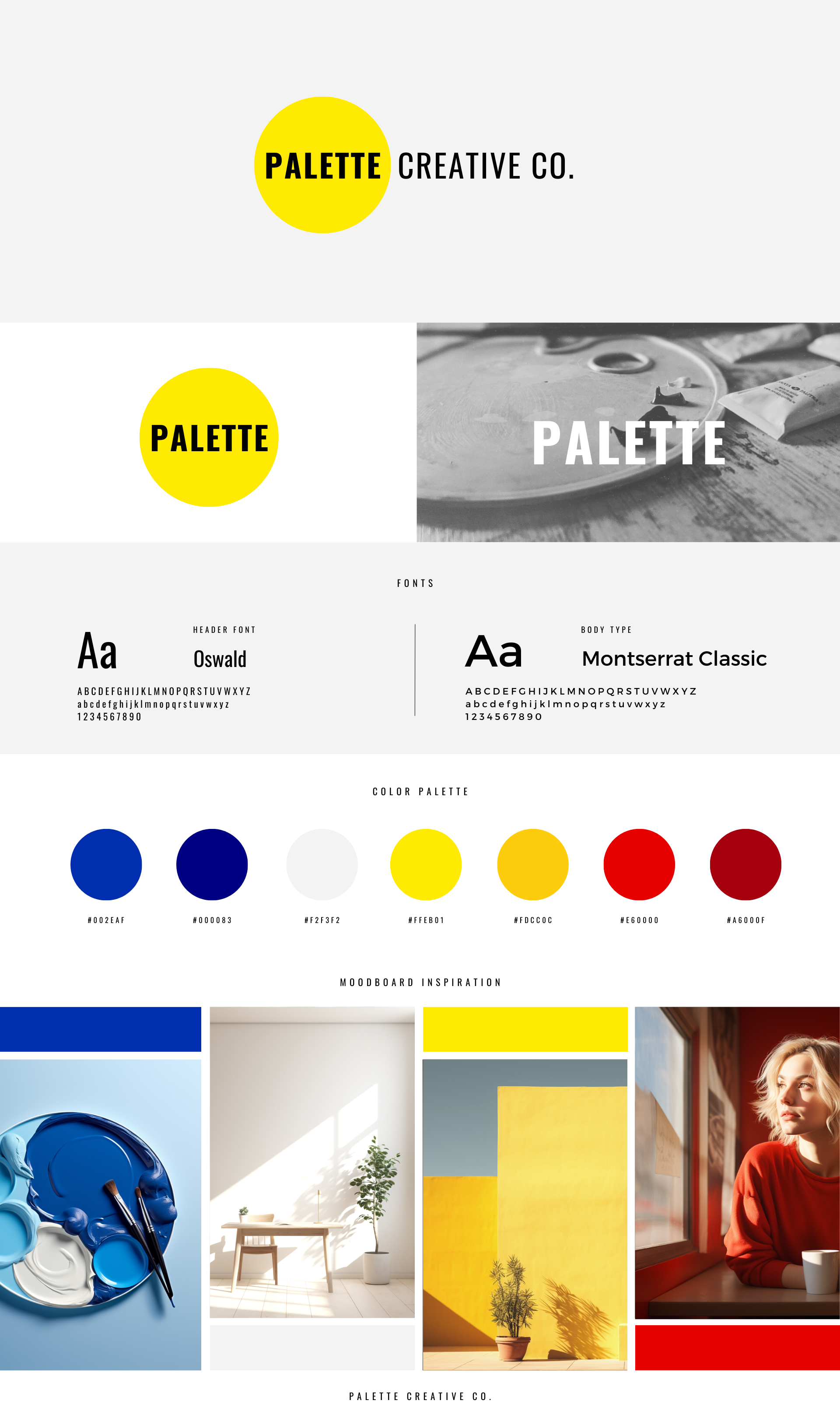
I am a fan of 1-page brand guides, especially as you get started or for small firms with limited marketing capacity. If you have more than this for your firm, bravo!
Below is an image of my 1-page brand guide for Palette Creative Co., which is my business associated with this newsletter.


0 Comments